Part Three of the Mastering Art Appreciation: From Novice to Connoisseur series
Introduction: The Magic of Colour in Art
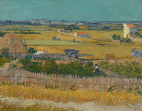
The magic of colour lies in its power to captivate and evoke emotion, drawing us into the world of an artwork with its vivid hues and subtle tones. I remember standing before Vincent van Gogh’s The Harvest (1888) at the Van Gogh Museum in Amsterdam, mesmerized by the warm colours that seemed to radiate the golden light of the south of France. The yellows of the wheat fields, the greens of the foliage, and the white farmhouses with purple shadows and orange rooftops transported me instantly to the Provençal countryside. In that moment, I realized how profoundly colour can shape our experience of art.
This post is the third entry in the Mastering Art Appreciation: From Novice to Connoisseur series, following “How to Get the Most Out of Your Museum Visit” and “Exploring Composition: The Foundation of Visual Art.” In this installment, we’ll explore the basics of colour theory in an accessible way, delving into the principles of hue, value, saturation, and colour harmony. We’ll uncover how artists use colour to create mood and meaning and analyze examples of famous artworks where colour takes center stage. Whether you’re drawn to the vibrant energy of Fauvist paintings or the meditative calm of muted landscapes, this post will help you unlock the secrets of colour in art.
Section I: The Basics of Colour Theory
What is Colour?
At its core, colour is the result of light interacting with the world around us. Light travels in waves, and different wavelengths correspond to different colours. Red, for instance, has the longest wavelength visible to the human eye, while violet has the shortest. When light hits an object, certain wavelengths are absorbed while others are reflected. These reflected wavelengths determine the colours we perceive. Our eyes contain special photoreceptor cells called cones, which are sensitive to different ranges of wavelengths—red, green, and blue. Together, these cones allow us to see the vast spectrum of colours.
Key Terms: Hue, Value, and Saturation
Understanding colour begins with three fundamental terms:
- Hue refers to the pure colour we identify by name—red, blue, yellow, and so on.
- Value describes the lightness or darkness of a colour. Adding white to red creates light pink while adding black produces deep burgundy.
- Saturation (or Chroma) measures the intensity or purity of a colour. Highly saturated colours are vivid and bold, while less saturated ones appear muted or subdued.
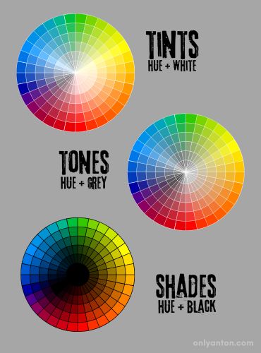
Tints, Shades, and Tones
Artists manipulate colours by altering their composition:
- Tints are created by adding white to a colour, lightening it.
- Shades result from adding black, darkening the colour.
- Tones emerge when grey (or a neutral colour) is added, softening the original hue.
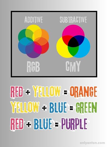
Additive and Subtractive Colour Models
The way colours mix differs based on the medium:
- Additive Colour (RGB) combines red, green, and blue light. Used in screens and digital media, mixing all three produces white light.
- Subtractive Colour (CMYK) involves the pigments cyan, magenta, yellow, and sometimes black (K). Combining cyan, magenta, and yellow creates black or dark brown in printing.
Primary, Secondary, and Tertiary Colours
Colours are traditionally grouped into three categories:
- Primary Colours: Red, blue, and yellow form the foundational colours. Artists cannot produce these colours from other colours.
- Secondary Colours: Green, orange, and purple emerge from mixing primary colours.
- Tertiary Colours: Created by blending a primary colour with a neighbouring secondary colour (e.g., yellow-green or blue-violet), these hues add depth to the palette.
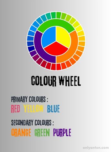
The Colour Wheel
An indispensable tool for artists is the colour wheel, a circular arrangement of hues. It visualizes relationships between colours, such as complementary (directly opposite) or analogous (side by side). By understanding these relationships, artists can create harmonious palettes, evoke specific moods, or introduce striking contrasts to their work.
Section II: Colour Harmony—Finding Balance
Colour harmony is essential to the visual impact of art. Harmonious combinations evoke feelings of beauty, balance, and unity, drawing the viewer’s eye and creating an emotional response. Conversely, discordant or disharmonious colours can create tension, intrigue, or even discomfort. Artists may use colour harmony or disharmony to evoke complex emotions. By understanding the principles of colour harmony, we can better appreciate how artists use colour relationships to shape the meaning and energy of their works.
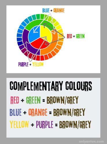
Complementary Colours
Complementary colours are opposites on the colour wheel, such as red and green or blue and orange. When placed side by side, these colours heighten each other’s intensity, creating vibrant contrast and dynamic energy. Artists often use this pairing to draw attention to specific areas or to add drama to a composition.
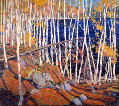
- Example: Tom Thomson’s In the Northland (1915) masterfully employs complementary colours, with oranges glowing against deep, cool blues. The striking contrasts evoke the vitality of the northern landscape while maintaining a sense of natural harmony.
Analogous Colours
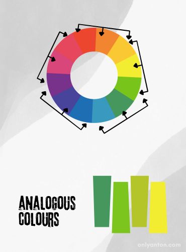
Analogous colours are neighbouring hues on the colour wheel, such as blue, blue-green, and green. These combinations create subtle, soothing harmony, often seen in landscapes and Impressionist paintings. Analogous palettes are known for their ability to unify a composition while maintaining gentle shifts in tone and mood.
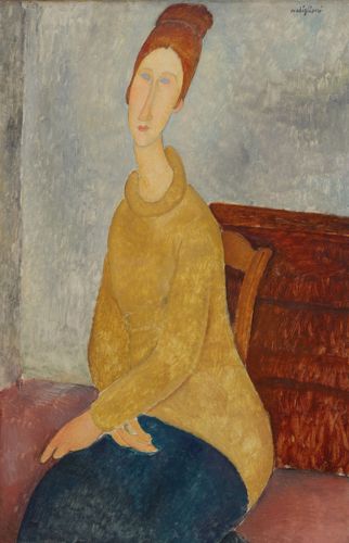
- Example: Amedeo Modigliani’s Jeanne Hébuterne with Yellow Sweater (1918) showcases analogous colour harmony through its warm palette of yellows, golds, and oranges. These subtle variations create a sense of emotional intimacy and visual cohesion, drawing the viewer into the sitter’s serene yet poignant presence.
Triadic Colours
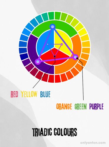
Triadic colour schemes involve three colours evenly spaced on the colour wheel, such as red, blue, and yellow. This approach balances visual contrast and harmony, providing vibrant energy without overwhelming the composition.
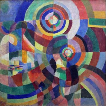
- Example: Sonia Delaunay’s Prismes électriques (1914) is a stunning example of triadic harmony. The artist uses bold reds, blues, and yellows arranged in dynamic geometric patterns to create a composition full of movement and energy. The interplay of these colours showcases how balance can coexist with bold contrasts.
Josef Albers’ Interaction of Colours
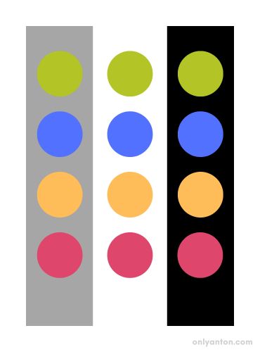
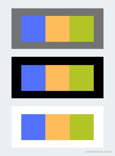
Josef Albers’ influential theory emphasizes how colours interact with one another, often appearing different based on their context. A single hue, for example, might seem more vibrant when placed beside a complementary colour or subdued next to a similar tone. Albers’ insights remind us that colour is not a fixed property but a dynamic experience shaped by relationships and perception. Artists exploit these interactions to manipulate how viewers perceive the colours and to add depth and complexity to their work.
Section III: Colour in Composition—Setting the Mood and Symbolism
Colour plays a vital role in shaping the mood and meaning of an artwork. Artists use it to evoke emotions, create atmosphere, and communicate cultural or personal messages. By understanding how colour interacts with composition, we can gain deeper insight into an artist’s intent and our own emotional responses.
Creating Mood Through Colour
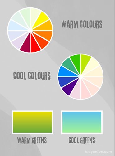
Warm colours such as reds, oranges, and yellows often evoke feelings of warmth, passion, or excitement. These hues tend to visually “come forward” in a composition, drawing the viewer’s eye and creating a sense of immediacy. Conversely, cool colours like blues, greens, and purples convey calm, sadness, or introspection and visually “recede,” lending depth to a scene.
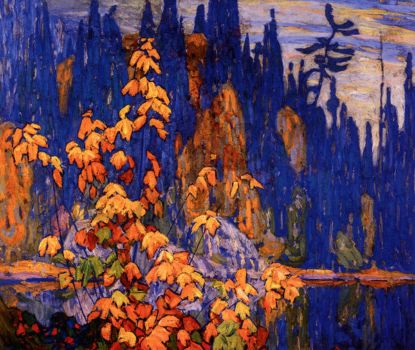
- Example: Lawren Harris’s Autumn, Algoma (1920) demonstrates how bold, contrasting colours can create a dramatic and dynamic mood. The vibrant oranges and yellows of the autumn foliage stand out against the deep, rich blues of the rocky terrain and sky. This vivid interplay of complementary colours imbues the scene with energy and vitality, capturing the grandeur and intensity of the Canadian wilderness in autumn.
Symbolism and Cultural Context
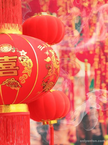
Colours carry deep cultural and symbolic meanings that vary widely across societies. Red, for instance, symbolizes luck and prosperity in China, while in Western contexts, it might represent danger, passion, or love. Artists often use these associations to add layers of meaning to their work.
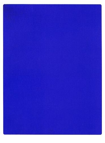
- Example: Yves Klein’s Blue Monochrome(1961) exemplifies how a single colour can evoke profound symbolic meaning. Klein described his monochrome painting as “the possibility of being immersed in the immeasurable existence of colour.” The striking blue, known as International Klein Blue (IKB), is a pure ultramarine pigment he patented to preserve its vibrancy and luminosity. The painting transcends physicality, representing spirituality, immateriality, and the infinite. Through this work, Klein invites viewers to experience the emotional and conceptual power of pure colour.
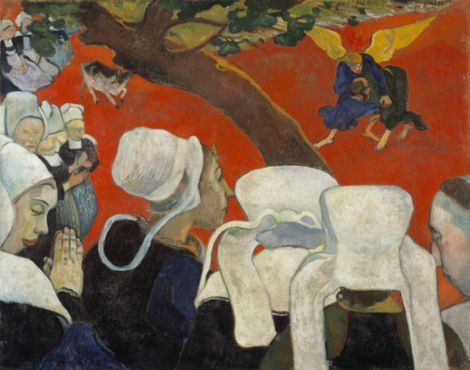
- Example: Paul Gauguin’s Vision of the Sermon (1888) is another striking example. He uses a bold, non-naturalistic red background to heighten spiritual tension and focus the viewer’s attention on the visionary nature of the scene.
Colour and Personal Interpretation
While colours can carry universal associations, personal experiences and cultural backgrounds often shape how individuals perceive and interpret them. A bright yellow might evoke joy for one viewer but nostalgia for another. This subjectivity underscores the importance of personal interpretation in art appreciation, reminding us that the magic of colour lies not only in its use but also in its reception.
Section IV: Analyzing Colour Use in Famous Works
Studying how artists use colour in their works provides invaluable insight into their creative processes and the effects they aim to achieve. Let’s explore three masterpieces where colour plays a central role, offering lessons in harmony, emotion, and form.
Georges Seurat – A Sunday Afternoon on the Island of La Grande Jatte (1884–85)
Why This Work?
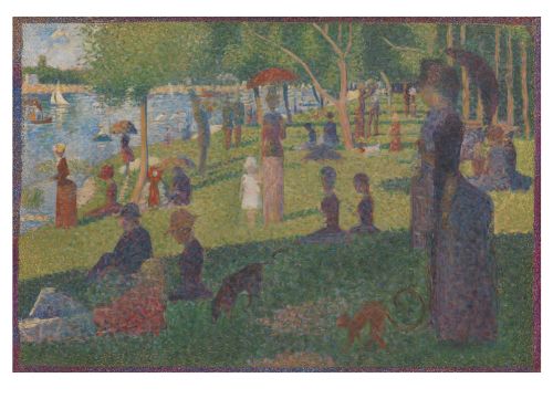
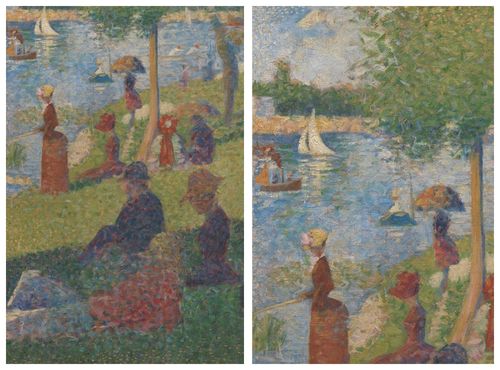
Seurat’s innovative Pointillism technique demonstrates the principles of optical colour mixing. By placing small dots of contrasting colours side by side, he creates an image that visually blends from a distance, achieving a luminous, vibrant effect. This approach highlights how scientific methods can enhance artistic expression.
What to Look For
Seurat employs complementary colours, such as reds and greens or blues and oranges, to create dynamic harmonies. For example, the cool blue water contrasts with the warm tones of the people’s clothing and the earthy greens of the park. Step back to fully appreciate how these dots interact, merging into a cohesive yet subtly complex scene.
Takeaway
Seurat’s work underscores the potential of colour science in art. It uses contrasts to create depth and a play of light that draws the viewer into the idyllic scene.
Henri Matisse – Open Window, Collioure (1905)
Why This Work?
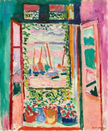
As a hallmark of Fauvism, Matisse’s Open Window, Collioure abandons naturalistic colour in favour of bold, non-representational hues. This painting challenges traditional expectations, inviting viewers to feel the scene emotionally rather than perceive it realistically.

Personal Note
During my visit to Collioure, I was struck by how the vibrant Mediterranean setting—its vivid light and intense colours—might have inspired Matisse’s palette. The interplay of warm and cool hues in his work seems to capture not just the place but the emotional energy of being there.
What to Look For
Notice the juxtaposition of warm tones, like the pinks and reds of the balcony, with cool blues and greens of the sea and sky. These contrasts create a vibrant energy, turning an ordinary view into an emotional experience.
Takeaway
Matisse teaches us that colour isn’t constrained by reality. It’s a powerful tool for expressing feeling and place through bold, emotive choices.
Paul Cézanne – Still Life with Apples and a Pot of Primroses (1890)
Why This Work?
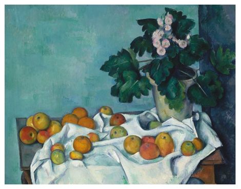
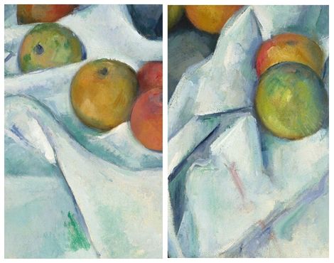
Cézanne’s still life paintings are renowned for their intricate use of colour. Even seemingly simple elements, like a white tablecloth, are transformed through subtle shifts in hue—yellows, blues, greens, and purples—that give the scene depth and form.
What to Look For
Cézanne uses colour planes to build structure and dimensionality, moving beyond flat representation. The interplay of colours between the apples, tablecloth, and pot creates a rhythm that leads the viewer’s eye across the composition. His subtle gradations challenge the notion of a static surface.
Takeaway
Cézanne demonstrates how colour can do more than decorate. It shapes space, texture, and the essence of objects, turning everyday items into extraordinary visual experiences.
Conclusion: Embracing the Magic of Colour
Colour is one of the most powerful tools in an artist’s palette, shaping an artwork’s mood, meaning, and visual impact. In this post, we’ve explored the basics of colour theory, from the science of how we perceive colour to the principles of harmony that artists use to create balance or tension. We’ve seen how warm and cool colours evoke different emotions, how cultural and symbolic meanings shape interpretation, and how famous artists like Seurat, Matisse, and Cézanne have harnessed the magic of colour to bring their visions to life.
As you visit museums or explore art during your travels, take a moment to observe colour more closely. Notice how hues interact, how they guide your eye, and how they make you feel. Pay attention to how colours can evoke warmth or coolness, energy or calm, or even invite reflection. These observations will deepen your appreciation of art and its visual language.
Finally, remember that colour is deeply personal. Each viewer’s experience is shaped by one’s background, memories, and emotions. Developing your eye for colour and discovering what moves you is a rewarding journey that brings you closer to understanding art and yourself.
What About You?
Have you ever found yourself captivated by the colours in a painting or noticed how certain combinations seem to resonate with you? Perhaps you’ve admired the harmony of analogous colours in a landscape or the bold contrasts of complementary hues in modern artwork. Do you have a favourite colour combination or palette that always catches your eye?
I’d love to hear your thoughts! Share your experiences with colour in art in the comments below. Have you noticed colour patterns or harmonies that stood out to you in a museum or during your travels? Let’s start a conversation about how colour enhances our appreciation of art.
Be sure to return to Only Anton for more posts in the Mastering Art Appreciation series as we continue this journey from novice to connoisseur. Your perspective enriches this space, so don’t hesitate to join in!
Further Reading and Resources
Related Posts on Only Anton
- How to Get the Most Out of Your Museum Visit: Learn how to appreciate art like a pro with tips on planning your visit, engaging with art, and making the most of your museum experience.
- Exploring Composition: The Foundation of Visual Art: Master the basics of art composition by exploring key elements and principles. Learn how structure guides the eye.
External Resources
These resources will deepen your understanding of colour theory, offering insights into its principles, history, and application and helping you continue your journey toward mastering art appreciation.
Books
- Interaction of Color: 50th Anniversary Edition (2013) by Josef Albers: A foundational text originally published in 1963 that explores the nuances of how colours interact and are perceived. Find it at your library, browse online, or grab your copy here.
- Color: A Natural History of the Palette by Victoria Finlay: A fascinating dive into the cultural and historical significance of different pigments. Check your local library, search online, or order a copy here.
- The Elements of Color by Johannes Itten: A classic book on colour theory and the principles of harmony and contrast. Discover it at your library, look it up online, or purchase your copy here.
- The History of Color: A Universe of Chromatic Phenomena by Neil Parkinson (2023): Explores the cultural, scientific, and artistic significance of colour throughout history, revealing its impact on human perception and creativity. Pick it up at a library, browse for it online, or buy a copy through this link.
- The Secret Lives of Colour by Kassia St. Clair (2017): Delves into the fascinating histories and cultural meanings of 75 colours, shades, and hues, uncovering their hidden stories and symbolism. Look it up at a local library, browse online, or buy your copy here.
- Color Theory for Artists: Everything You Need to Know about Working with Color by Ian Goldsmith (2024): A practical guide for artists, offering insights into the principles of colour theory, colour mixing, and creating harmonious palettes in art. Locate it at a library, check online options, or purchase it here.
Articles
- “The Biology of Color” by Innes Cuthill, William Allen, et al., Science (Vol. 357, No. 6350, August 2017): Explores the evolutionary and biological roles of colour in nature, including its significance in communication, camouflage, and mate selection. Read the article here.
- “How to Spin the Colour Wheel, by Turner, Malevich and More,” Tate Museum: Examines how artists such as Turner and Malevich utilized the colour wheel to create dynamic compositions and explore colour relationships in their work. Find the article here.
- “Color and Form,” by Jennifer Farrell, Metropolitan Museum of Art (November 2023): Highlights the interplay of colour and form in drawings and prints, showcasing how artists use these elements to evoke mood and meaning. Read the article here.
Websites and Online Resources
- The Van Gogh Museum: Explore Van Gogh’s use of colour in masterpieces like The Harvest.
- Artists Network: Tutorials and resources for mastering colour and other aspects of your art practice.
- Colour Coursework Guide, Tate Museum: A comprehensive guide to understanding and applying colour theory, featuring practical exercises, historical insights, and analysis of artworks from the Tate’s collection.
- Great Art Explained on YouTube: Engaging videos breaking down famous artworks and their use of colour, or visit the website.
Works Cited (in order of appearance)
Images used in this post are for educational and commentary purposes under Fair Use principles. Sources are credited, and permissions are obtained for licensed materials where possible.
Vincent van Gogh, The Harvest, 1888. Oil on canvas. Collection of the Van Gogh Museum, Amsterdam.
Tom Thomson, In the Northland, 1915. Oil on canvas. Collection of the Art Gallery of Ontario, Toronto.
Amedeo Modigliani, Jeanne Hébuterne with Yellow Sweater, 1918. Oil on canvas. Collection of the Kunstmuseum Basel, Switzerland.
Sonia Delaunay, Prismes électriques, 1914. Gouache on paper. Private collection.
Lawren Harris, Autumn, Algoma, 1920. Oil on canvas. Collection of the McMichael Canadian Art Collection, Kleinburg, Ontario.
Yves Klein, Blue Monochrome (IKB 3), 1961. Pigment and synthetic resin on canvas. Private collection.
Paul Gauguin, Vision of the Sermon (Jacob Wrestling with the Angel), 1888. Oil on canvas. National Galleries of Scotland.
Georges Seurat, A Sunday Afternoon on the Island of La Grande Jatte, 1884–1886. Oil on canvas. Collection of the Art Institute of Chicago, Chicago.
Henri Matisse, Open Window, Collioure, 1905. Oil on canvas. Collection of the National Gallery of Art, Washington, D.C. (Gift of Mrs. John Hay Whitney).
Paul Cézanne, Still Life with Apples and a Pot of Primroses, 1890. Oil on canvas. Collection of the Metropolitan Museum of Art, New York.
