Part Two of the Mastering Art Appreciation: From Novice to Connoisseur series

Introduction: Exploring Composition in Art
Exploring composition is like uncovering the invisible framework that holds a piece of art together. You’ve likely felt it before—standing in a museum, captivated by a painting that feels balanced or complete, even if you couldn’t quite say why. During a recent trip to the Kunsthistorisches Museum in Vienna, I experienced this firsthand with Pieter Bruegel the Elder’s Hunters in the Snow. The painting’s meticulous arrangement of figures and sweeping landscape drew me in effortlessly. Though I’ve admired this piece in books and online for years, seeing it in person was a revelation. The composition created a quiet rhythm, carrying my gaze across the winter landscape and offering a sense of calm amid its cold beauty. That moment reminded me that the way elements are arranged on a canvas can profoundly shape how we experience a work of art.
This post marks the second entry in the Mastering Art Appreciation: From Novice to Connoisseur series, following the introductory post, “How to Get the Most Out of Your Museum Visit.” In this installment, we’ll dive into the essential elements and principles that artists use to structure their work. Whether you’re a seasoned art lover or just beginning your journey, this guide will offer tools to engage with art on a deeper level and introduce key terminology to help articulate your thoughts.
Throughout this post, we’ll explore how composition creates visual harmony, directs the viewer’s attention, and conveys meaning. By the end, you’ll have a sharper eye for recognizing compositional patterns and a richer appreciation for the visual storytelling that unfolds through an artist’s careful arrangement of elements.
Section I: What is Composition?
Composition refers to the deliberate arrangement of elements within a piece of art designed to create a cohesive and visually engaging whole. Composition is about more than just making a work aesthetically pleasing. It’s also a tool that artists use to guide the viewer’s eye, evoke emotions, and provoke thought. The way shapes, colours, lines, and spaces are organized influences how we experience the artwork. A composition often leads us to focus on certain areas, feel specific emotions, or interpret a narrative embedded within the piece.
A helpful analogy is to think of composition as similar to the structure of a well-written story or a harmonious piece of music. Every sentence, character, and scene contributes to the plot of a story. Each note, chord, and rhythm in music supports the overall melody. Similarly, in art, every element—no matter how subtle—plays a role in forming a unified composition. Without this structure, a piece of art can feel disjointed, just as a story without narrative flow or a piece of music without rhythm can seem confusing or incomplete.
On a Practical Note:
As you explore museums or galleries, begin to look for the underlying composition of artworks. Notice how certain elements draw your attention or how your gaze naturally moves across the piece. Where is my eye drawn first in a painting? Where does my gaze move next? What elements guide my eye? Developing an awareness of composition will help deepen your engagement with art, enhancing your visual experience and your ability to articulate what resonates with you.
Section II: The Elements of Composition
The elements of composition are the essential building blocks of art. Artists arrange these individual components to create visually compelling and meaningful works. Understanding these elements helps us recognize the deliberate choices artists make to guide our eyes, evoke emotions, and tell visual stories. Below is an exploration of four key elements: a) Line, b) Shape and Form, c) Space, and d) Texture.
a) Line
Line is one of the most fundamental elements in visual art. It serves as a way to define shapes and as a tool to evoke emotions and create movement within a composition. Lines come in different directions, each with its own expressive qualities.
- Curved lines suggest softness, grace, or rhythm.
- Diagonal lines convey energy, tension, or movement.
- Horizontal lines create a sense of calm, stability, or rest.
- Vertical lines evoke strength, authority, or growth.
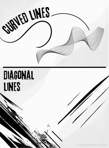
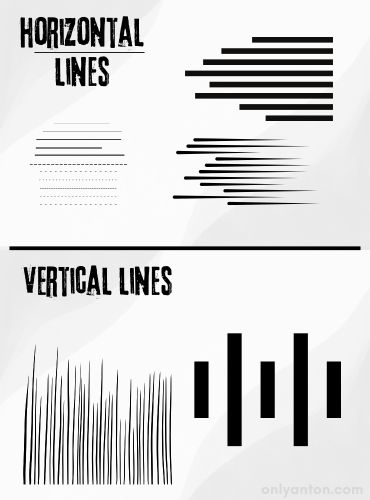
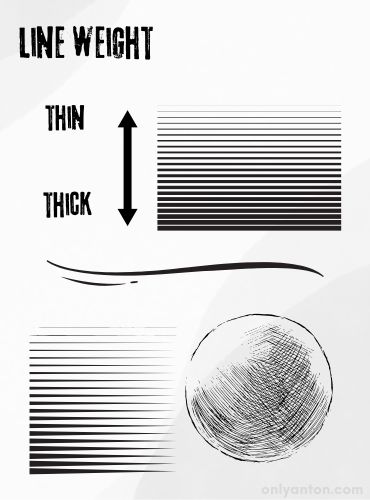
Artists also use implied lines—a series of objects or shapes arranged so the viewer’s eye naturally connects them. These lines subtly guide the viewer’s gaze through the artwork, creating a visual path. Additionally, line weight—the thickness or lightness of a line—also directs attention. Heavier lines provide emphasis or visual grounding, anchoring forms within the composition. Lighter lines introduce rhythm, delicacy, or a sense of movement. The skillful use of varying line weights adds complexity and depth to a piece, influencing how we experience it.
b) Shape and Form
Shapes are flat, two-dimensional areas that can be geometric (circles, triangles, squares) or organic (irregular and freeform). Artists use shapes to organize elements, create balance, or convey meaning. For example, precise geometric shapes like squares and pyramids suggest structure, stability, or control. Organic shapes evoke natural forms, such as plants or the human body, creating a sense of spontaneity or life.
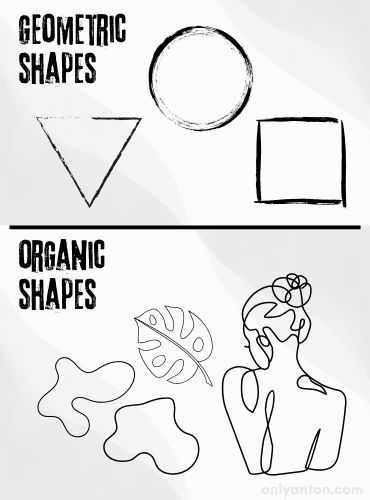
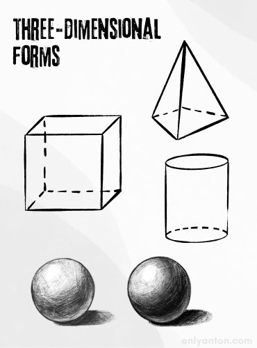
Forms differ from shapes in that they are perceived as three-dimensional, suggesting volume and depth. While a painting remains a two-dimensional surface, artists can depict forms—like spheres, cubes, or cylinders—using shading, highlights, and perspective to create the illusion of depth. The interplay between flat shapes and three-dimensional forms enriches a composition, inviting viewers to engage with both the surface and the perceived space beyond it.
c) Space
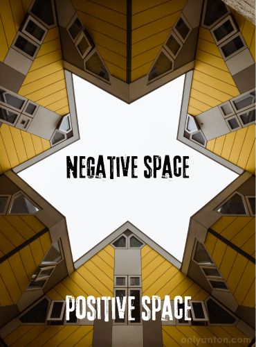
Space refers to the areas within and around objects in an artwork. Artists carefully balance positive space (the filled areas occupied by shapes or forms) with negative space (the empty or open areas) to create harmony and visual interest. A well-balanced composition intentionally uses these spaces to create tension, serenity, or rhythm.
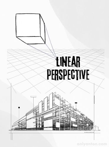
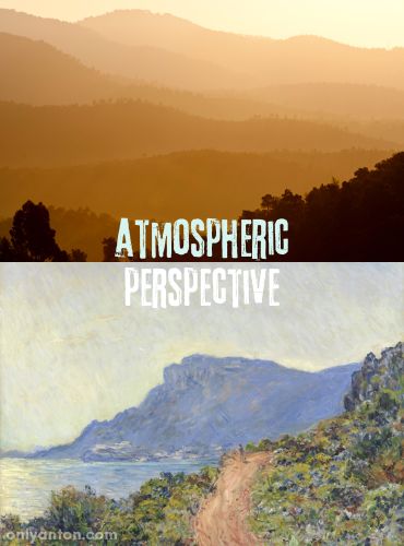
In two-dimensional works, artists use techniques like linear perspective and atmospheric perspective to suggest depth. Linear perspective involves converging lines that lead the viewer’s eye into the distance, creating the illusion of three-dimensional space on a flat surface. Atmospheric perspective uses colour and tone to mimic the effects of distance. Objects that are farther away appear lighter, softer, and less distinct than nearer objects. These tools allow artists to manipulate space, giving viewers the sensation of stepping into a landscape or environment.
d) Texture
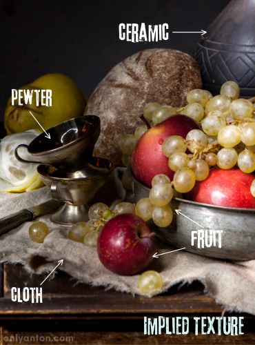
Texture adds a tactile quality to a work of art, even if the texture is only perceived visually. Artists use texture to engage the senses, adding interest and variety. There are two types of texture: real texture and implied texture.
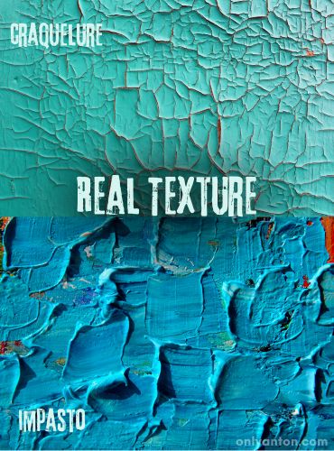
- Real texture refers to an artwork’s actual surface quality. In sculpture, this might be the roughness of stone or the smoothness of bronze. In painting, techniques like impasto—where paint is applied thickly—create a tactile surface that invites closer inspection.
- Implied texture mimics the appearance of texture in two-dimensional works. Artists like Jan van Eyck and Hans Holbein mastered the art of depicting materials such as silk, lace, fur, or metal with astonishing realism. This technique, sometimes referred to as trompe l’oeil (French for “deceive the eye”), gives viewers the illusion that they could reach out and touch the depicted surfaces.
Texture plays a crucial role in shaping how we experience art. It influences the visual appeal of a piece and evokes tactile sensations in the viewer’s mind. Whether real or implied, texture adds depth, richness, and complexity to artworks, enhancing their sensory impact.
By paying attention to these essential elements—line, shape and form, space, and texture—viewers can begin to decode the visual language of art. These elements form the underlying structure that makes compositions feel engaging, balanced, and meaningful. As you continue your exploration of art, try observing how artists use these building blocks to create visual harmony and tell compelling stories.
Section III: The Principles of Composition
While the elements of composition form the foundation of visual art, the principles of composition govern how these elements are arranged to create a harmonious and meaningful work. These principles shape how we experience art by guiding our attention, creating balance, and generating visual rhythm. Below is a breakdown of six essential principles: 1) Balance, 2) Contrast, 3) Emphasis and Focus, 4) Movement and Rhythm, 5) Pattern and Repetition, and 6) Unity and Harmony.
1) Balance
Balance refers to how visual weight is distributed across an artwork to create stability. There are many ways to achieve balance, but symmetry and asymmetry are two primary types of balance.
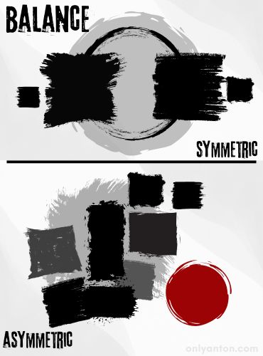
- Symmetry occurs when elements on either side of a central axis mirror each other. This type of balance evokes a sense of calm, stability, and order, often found in classical works. Raphael’s The School of Athens (1509-11) is a great example, where architectural features and figures are arranged symmetrically to emphasize balance and harmony.
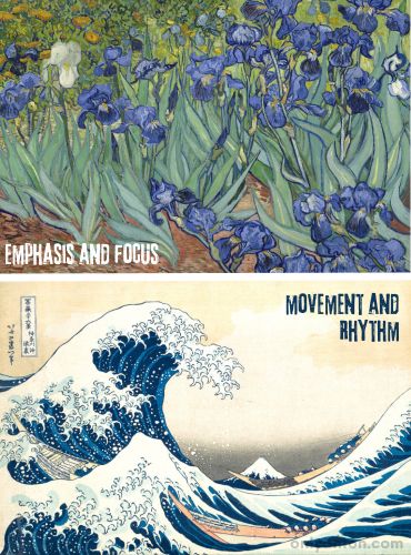
- Asymmetry is achieved when elements are intentionally unbalanced or skewed to one side or the other, but a sense of visual equilibrium is still maintained. Asymmetrical compositions create dynamic, engaging works that evoke energy and tension. Van Gogh’s Irises (1889) exemplifies this type of balance. Clusters of blue flowers and green foliage are unevenly arranged, with one white flower standing out in contrast and as a centre of focus. Nevertheless, the overall composition still feels balanced.
Beyond symmetry and asymmetry, artists often use visual balance, where different elements—like colour, shape, or size—create a sense of equilibrium. For example, a small, bright red shape in one corner of a composition might visually balance larger, darker forms elsewhere as the colour’s intensity draws the eye. Visual balance requires subtle precision and helps prevent any single area from overpowering the whole.
2) Contrast
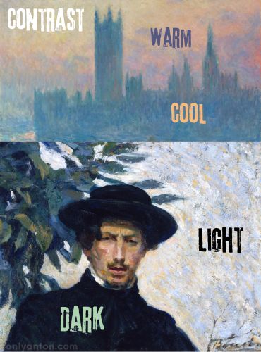
Contrast adds visual interest by juxtaposing opposing elements, such as light and dark, large and small shapes, or warm and cool colours. This principle emphasizes differences, creating tension that draws the viewer’s attention. Claude Monet, for example, contrasts warm and cool colours in his “Houses of Parliament, Sunset.” In his “Self-Portrait,” Umberto Boccioni contrasts light and dark.
Another practical example would be a 17th-century Dutch still-life painting, in which the contrast between glossy fruits, smooth pewter, and rough, worn surfaces heightens the composition’s realism (see image above under Texture). The interplay of textures, tones, and light creates a vivid sensory experience, making it impossible to look away.
Artists use contrast to guide the viewer’s eye to specific areas and evoke emotional responses. Strong contrasts create drama, while more subtle contrasts provide depth and nuance to the artwork.
3) Emphasis and Focus
Emphasis refers to the way artists direct the viewer’s gaze toward a particular area of the artwork, often called the focal point. Artists may use colour, size, or placement to focus attention. Human figures or faces frequently serve as natural points of emphasis.
In many religious paintings, for example, the viewer’s gaze is naturally drawn to the central figure through strategic emphasis. Bright colours or central placement often highlight key characters, helping viewers understand the narrative focus. Artists may also use subtle compositional techniques, like diminishing detail around the focal point, to clarify the emphasis.
4) Movement and Rhythm
Movement refers to how the artist guides the viewer’s eye through the composition, creating a sense of flow. Artists can suggest such movement through lines, shapes, or directional elements that naturally lead the gaze across the artwork.
A figure’s gaze or an outstretched hand can generate implied movement, subtly directing attention. For instance, in Leonardo da Vinci’s The Last Supper (1495-98), the apostles’ gestures and glances direct the viewer’s eye towards the figure of Christ in the centre. These directional cues create a dynamic sense of movement even without obvious physical lines.
Rhythm occurs through the repetition of implied movement across the artwork, much like musical rhythms that build continuity and anticipation. Artists generate this sense of rhythm by using repeating forms, such as a series of arches or overlapping brushstrokes.
5) Pattern and Repetition
Repetition involves the use of recurring elements, such as shapes, lines, or colours, to create patterns. Patterns provide structure and bring a sense of familiarity and comfort to an artwork. They can also introduce rhythm, guiding the viewer’s eye in predictable or soothing ways.
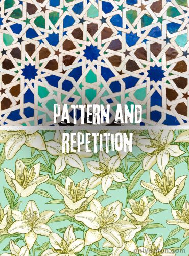
This principle is especially evident in decorative arts, such as Islamic tilework or textile design, where repeated motifs create intricate patterns. In painting, repetition can create unity within an otherwise complex scene by reinforcing visual themes or connecting different elements.
6) Unity and Harmony
Unity ensures that all parts of an artwork feel interconnected, giving the viewer a sense that every element belongs within the composition. Without unity, a work may feel disjointed or chaotic. Artists achieve unity by carefully selecting and arranging elements to complement each other.
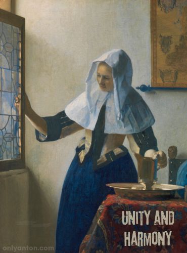
Harmony takes unity a step further, ensuring that no single part of the artwork dominates or feels out of place. For example, in Monet’s Water Lilies (1919), the interplay of soft brushstrokes, cool colours, and fluid lines creates a harmonious composition. No single element overpowers the rest. Instead, all components work together to induce a mood of tranquillity.
By understanding these six principles—Balance, Contrast, Emphasis and Focus, Movement and Rhythm, Pattern and Repetition, and Unity and Harmony—viewers can better appreciate how artists arrange elements to create engaging and cohesive compositions. As you continue exploring art, try observing how these principles are applied and notice how they influence your emotional and intellectual response to different works.
Section IV: Analyzing Composition in Famous Works
Now that we’ve explored the elements and principles of composition, it’s time to apply these concepts to well-known artworks. Understanding how master artists arrange visual elements can deepen our appreciation for art and enhance our ability to engage with it meaningfully. Below are three examples from different artistic movements—Classical, Modernist, and Impressionist—that illustrate the effective use of composition.
1. Renaissance Work: Leonardo da Vinci’s The Last Supper (1495-98)
Da Vinci’s The Last Supper exemplifies the principles of symmetrical composition, guiding the viewer’s eye toward a central focal point. The figures of Christ and the apostles are arranged horizontally, with Christ placed directly in the middle. This symmetry evokes a sense of order, stability, and solemnity appropriate for such a profound moment.
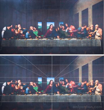
The painting also demonstrates the use of balance and movement. Although the figures are symmetrically positioned, their varied postures and gestures create energy and rhythm, drawing the viewer’s eye across the canvas. The apostles’ reactions—expressed through hand gestures and facial expressions—form an invisible line that directs attention toward Jesus. Christ’s serene expression contrasts with the apostles’ animated movements, emphasizing his spiritual significance in the composition.
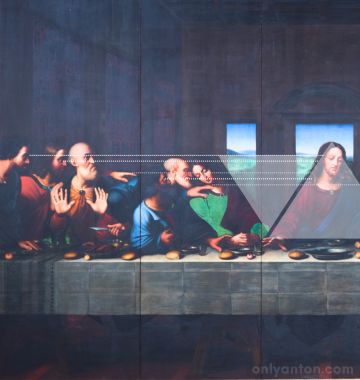
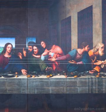
Additionally, da Vinci uses linear perspective to enhance the composition. All vanishing lines converge at Christ’s head, subtly reinforcing his role as the focal point. This careful arrangement creates a sense of depth and pulls the viewer’s focus into the heart of the narrative.
2. Modernist Work: Piet Mondrian’s Composition with Red, Yellow, and Blue (1930)
Mondrian’s abstract work, Composition with Red, Yellow, and Blue, offers an excellent example of visual balance through the interplay of colour, shape, and line. Though asymmetrical, the composition feels balanced, with the primary colours (red, yellow, and blue) carefully distributed across the canvas. The visual balance is affected If one changes the red block to blue. The white spaces between the coloured blocks contribute to a sense of harmony by allowing the bold colours to breathe.
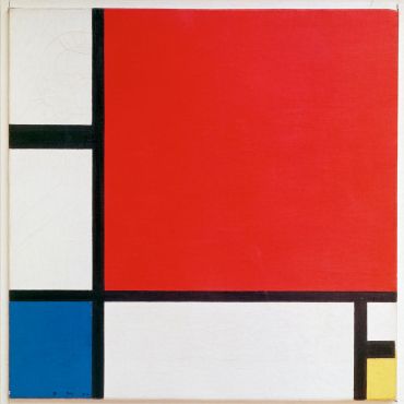
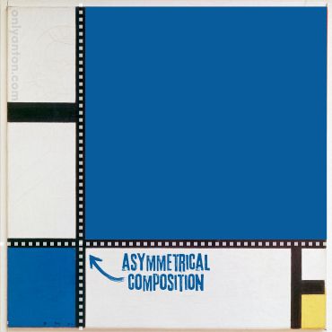
Mondrian’s use of horizontal and vertical lines forms a grid-like structure, creating rhythm and guiding the viewer’s gaze through the artwork. The lines vary in thickness, with some heavier lines grounding the composition and others acting as subtle connectors between coloured areas. This interplay of line and colour generates a dynamic equilibrium, demonstrating how the artist can achieve balance even without symmetry.
This work exemplifies Modernist ideals by stripping art down to its fundamental components—line, colour, and form. The composition’s abstract nature encourages viewers to focus on the relationships between these elements, fostering a deeper appreciation of visual harmony.
3. Impressionist Work: Claude Monet’s Water Lilies (1919)
Monet’s Water Lilies provides a serene example of organic composition, where fluid brushstrokes and subtle colour harmonies create a sense of movement and tranquillity. Monet’s composition emphasizes softness and flow, unlike the crisp, linear arrangements seen in Classical works. The composition encourages viewers to immerse themselves in the scene.
The brushstrokes lack hard edges, allowing colours to blend naturally and evoke the water’s shimmering surface. The repetition of lily pads across the canvas creates rhythm, while the varying shades of blues and greens generate a soothing atmosphere. This interplay of colour and texture reflects the principles of harmony and unity, as no single element dominates the composition.
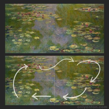
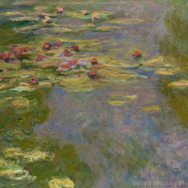
Monet’s painting exemplifies movement without direction—the viewer’s eye drifts gently across the canvas, much like the floating lilies. The composition invites contemplation, embodying the Impressionist focus on capturing fleeting moments and the emotional essence of a scene.
By examining these three artworks—The Last Supper, Composition with Red, Yellow, and Blue, and Water Lilies—we can see how artists across different eras have used composition to shape our experience of their work. Each piece employs unique strategies to evoke emotion, guide the eye, and create harmony, thus demonstrating the power of composition as a tool for storytelling. As you visit museums or explore art online, try analyzing composition in other works. Observe how the arrangement of elements influences your experience and understanding of the art.
Conclusion
Composition is the invisible framework that underpins visual art, giving structure and meaning to every brushstroke, shape, and line. In this post, we explored the elements of composition—such as line, shape, space, and texture—and how they work together with the principles of composition—like balance, contrast, movement, and unity—to create visual harmony. Whether the goal is to evoke emotion, guide the viewer’s gaze, or tell a story, composition is the foundation that makes art come alive.
I encourage you to apply what you’ve learned here. As you visit museums, explore galleries, or encounter artworks while travelling, take time to observe how composition shapes your experience. Look closely at how elements are arranged, guide your eye, and make you feel. Practicing these skills will deepen your appreciation for art, even when you may not be familiar with the subject matter or style.
Remember, composition affects everyone differently. Each viewer brings their own perspective and interpretation to a work of art. Developing your eye for composition is part of the journey toward personal art appreciation. There is no right or wrong way to see art—only the joy of engaging with it and discovering new ways to look at the world around you.
What About You?
Have you ever noticed the elements of composition at play in a work of art? Do you find yourself drawn to symmetrical balance with its sense of stability, or do you prefer the dynamic tension of asymmetrical compositions? Perhaps a particular painting or artwork resonates with you because of its composition.
I’d love to hear your thoughts! Share your experiences in the comments concerning a favourite artwork, a memorable museum visit, or how you’ve started noticing composition in art around you. Engaging with other readers can offer new perspectives, so don’t hesitate to join the conversation.
Further Reading and Resources
These resources will deepen your understanding of composition and help you continue your journey toward mastering art appreciation.
Related Posts on Only Anton
- How to Get the Most Out of Your Museum Visit: Learn how to appreciate art like a pro with tips on planning your visit, engaging with art, and making the most of your museum experience.
- Sublime Travel: Making Your Trip Awesome, Not Awful: Incorporate awe-inspiring moments into your travels with practical tips on balancing the sublime for memorable journeys.
External Resources
Books
- The Joy of Art: How to Look At, Appreciate, and Talk about Art by Carolyn Schlam (2021): A practical guide for developing a deeper appreciation of art, offering tools to engage meaningfully with artworks and articulate personal interpretations. Look for it at a local library, online, or get a copy here.
- Masterpieces of Art Explained: Discover famous artworks and their finer details by Christopher P. Jones (2023): A close examination of iconic artworks, breaking down their key elements and historical significance to uncover subtle details. Find it online, at a library, or buy a copy here.
- Mastering Composition: Techniques and Principles to Dramatically Improve Your Painting by Ian Roberts (2007): A comprehensive guide to mastering composition, focusing on principles and strategies to enhance the structure and visual impact of paintings. Read it online, borrow it from a library, or get your copy here.
- The Painter’s Secret Geometry: A Study of Composition in Art by Charles Bouleau (2014): An in-depth study of geometric principles and their application in art, revealing hidden structures that enhance visual harmony. Look for it at a local library, online, or get a copy here.
Articles
- “What’s the Visual Path of Your Artwork?” by Dan Scott (July 2023): This article explores how artists guide viewers’ eyes through a composition using visual paths, with practical tips on creating flow and focus in artwork. Read the article here.
YouTube
- Great Art Explained: This YouTube channel offers accessible, in-depth video analyses of iconic artworks, uncovering their historical, cultural, and artistic significance.
Websites
- Khan Academy Art History: A free resource covering major art movements and techniques, including principles of composition.
- The Metropolitan Museum of Art: Explore artworks from the Met’s collection and learn about composition through online exhibits.
- Google Arts & Culture: Access high-resolution images of famous artworks, allowing you to analyze composition in detail.


